Funnel case study
Behind Noom’s weight-loss quiz funnel
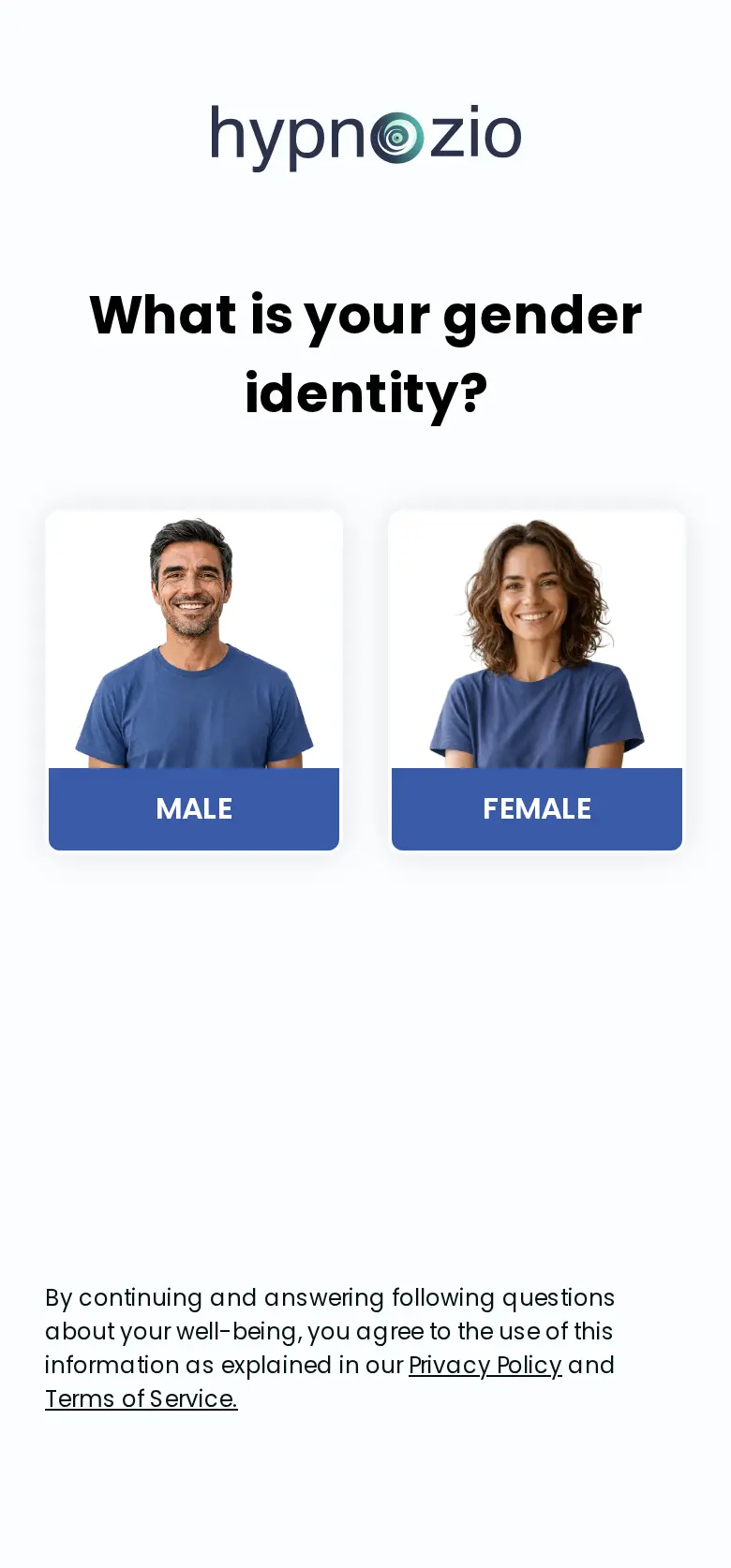
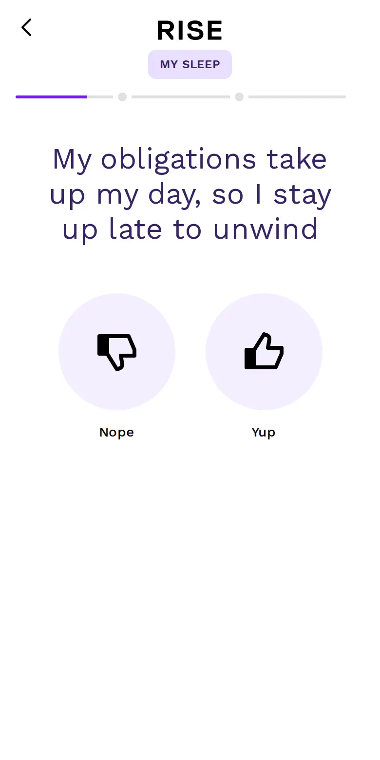
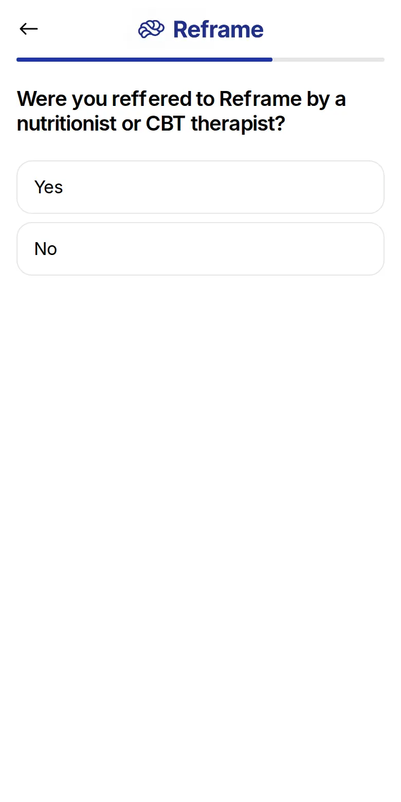
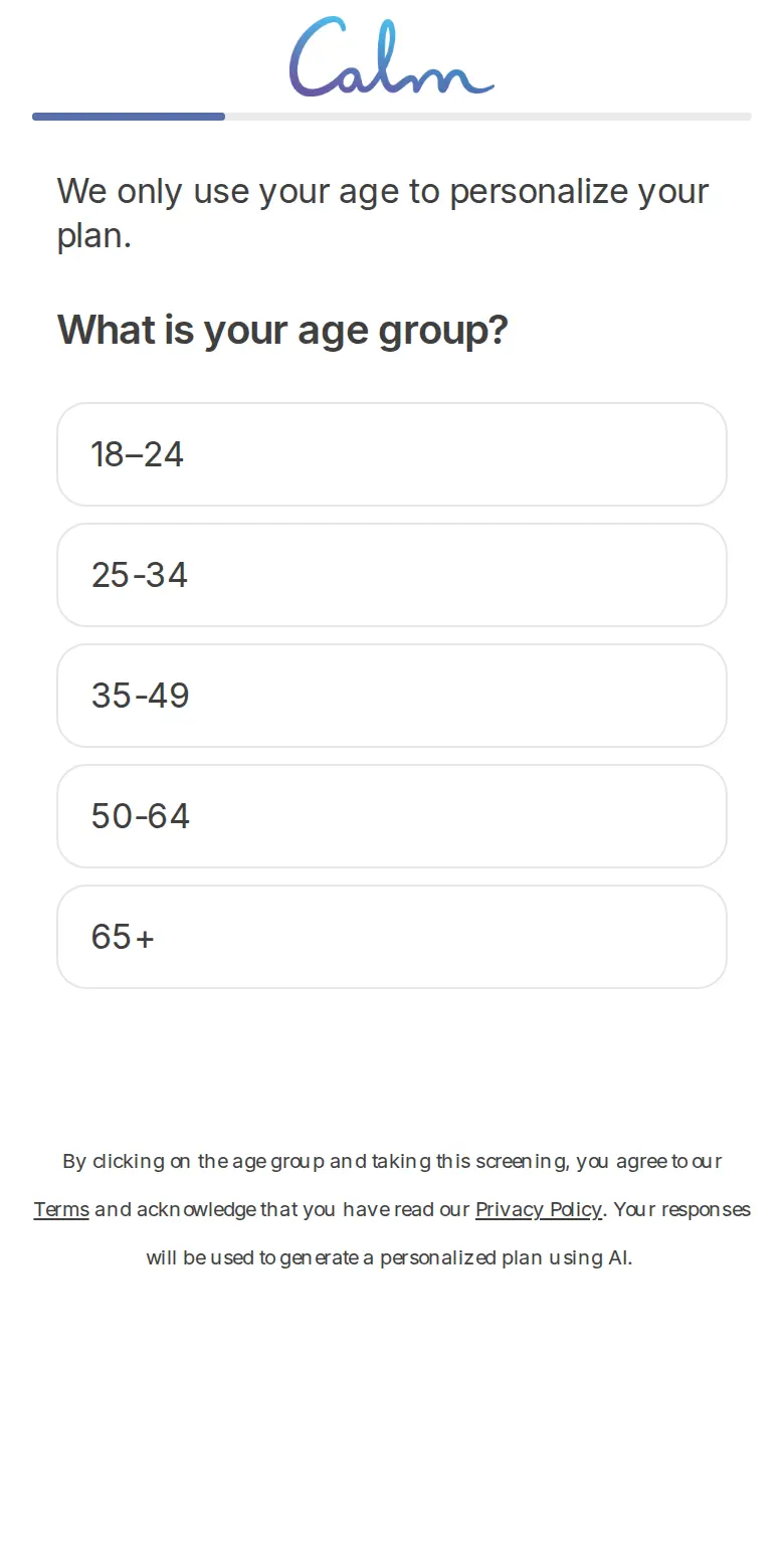
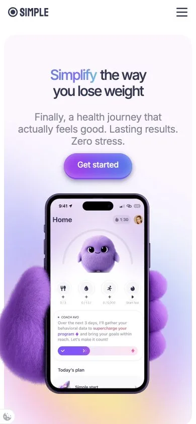
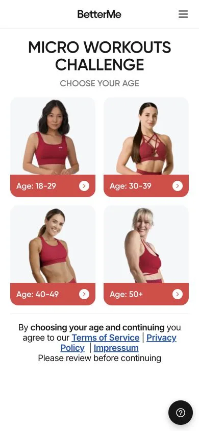
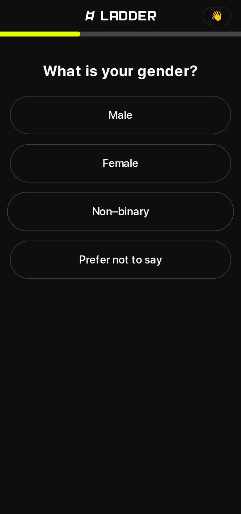
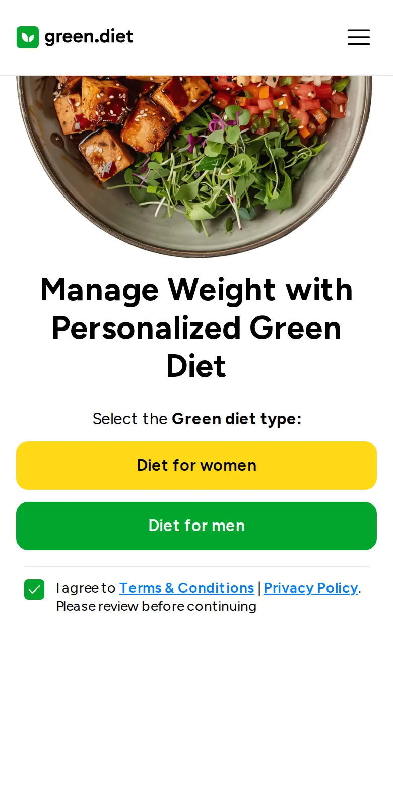
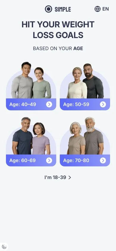
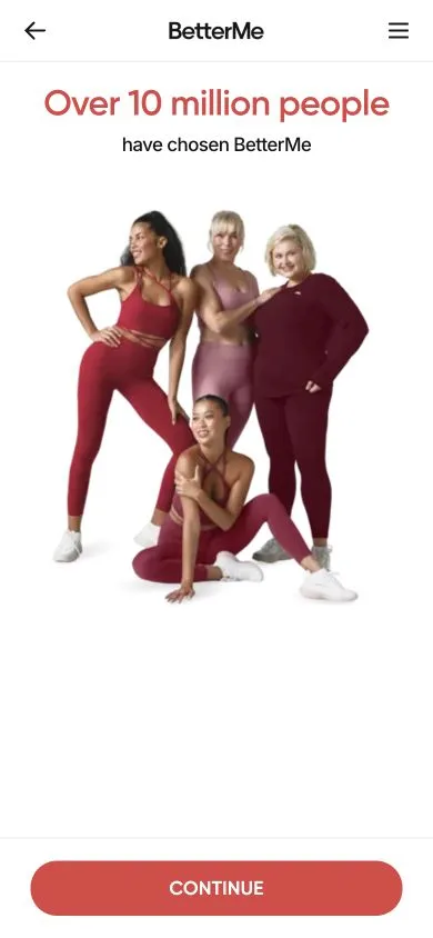
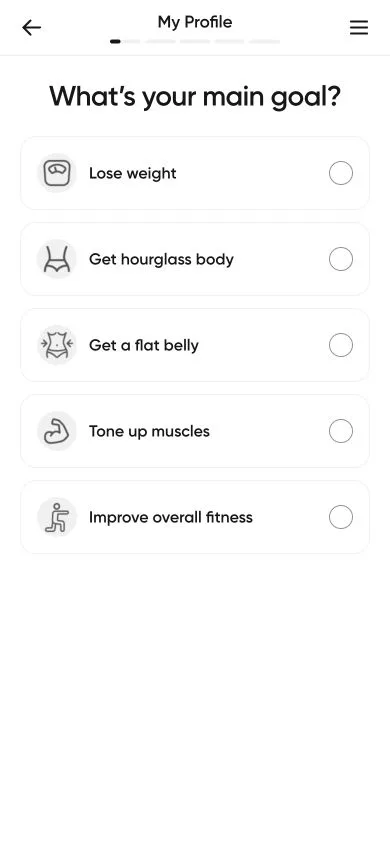
Noom turns a weight-loss goal into a behavioural profile, teaches its method through small questions, then offers a trial with a choice of prices.
Noom, in numbers
Where Noom’s ads lead
- Distinct Meta ads in this sample
- 101
- Weight-loss quiz family
- 95 ads94%
- Other Noom destinations
- 6 ads6%
Mostly German quiz URLs; the walkthrough is English. Captured 23 October 2026.
- €160.1kGermany & Austria sample
- Android downloads
- 10M+Cumulative installsGoogle Play
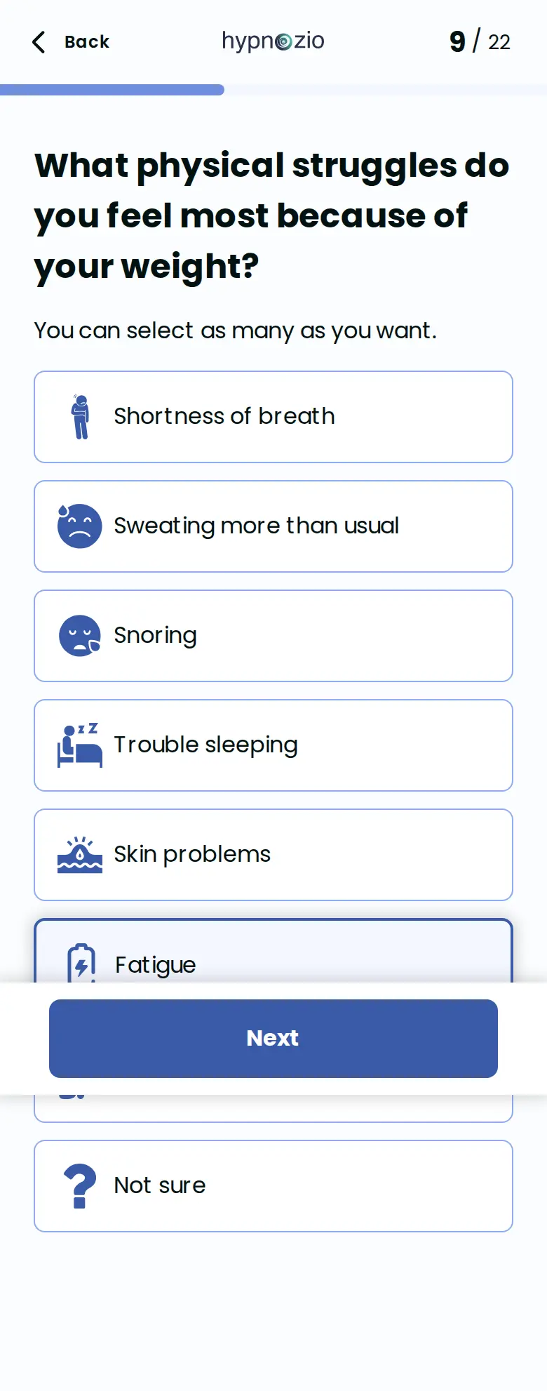
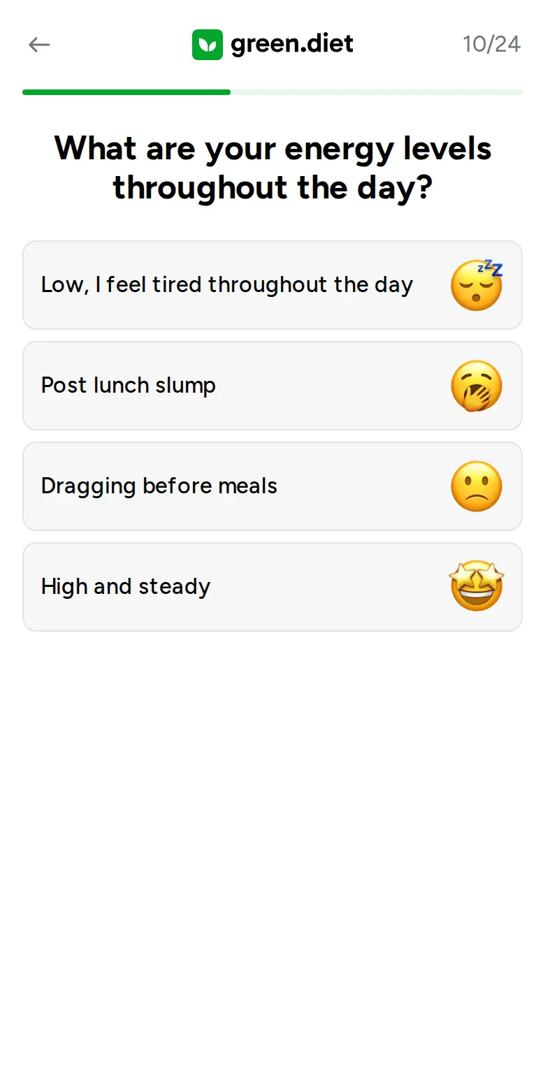
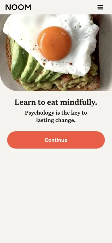
The funnel, screen by screen
Hover to preview. Click a pin to read more.
The top 5 tactics
Ranked by their role in this captured journey.
- 01
Let visitors try the method before buying
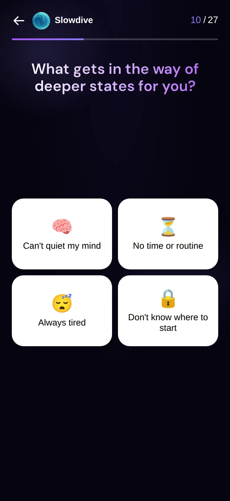
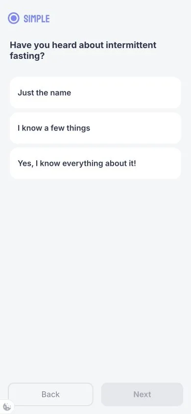
Food choices become short lessons. Later, three knowledge questions give feedback immediately, so the visitor experiences Noom’s teaching style before the trial offer.
- 02
Make earlier answers visible in the result
A named behavioural profile, repeated preferences and selected enhancement themes turn the assessment into a recognizable plan. Those details carry through to checkout.
- 03
Match proof to the concern it answers
A specific results claim builds credibility early. A lifestyle-focused testimonial addresses the effort of sticking with a plan, and personal forecasts make the proposed outcome concrete.
- 04
Make the next commitment feel manageable
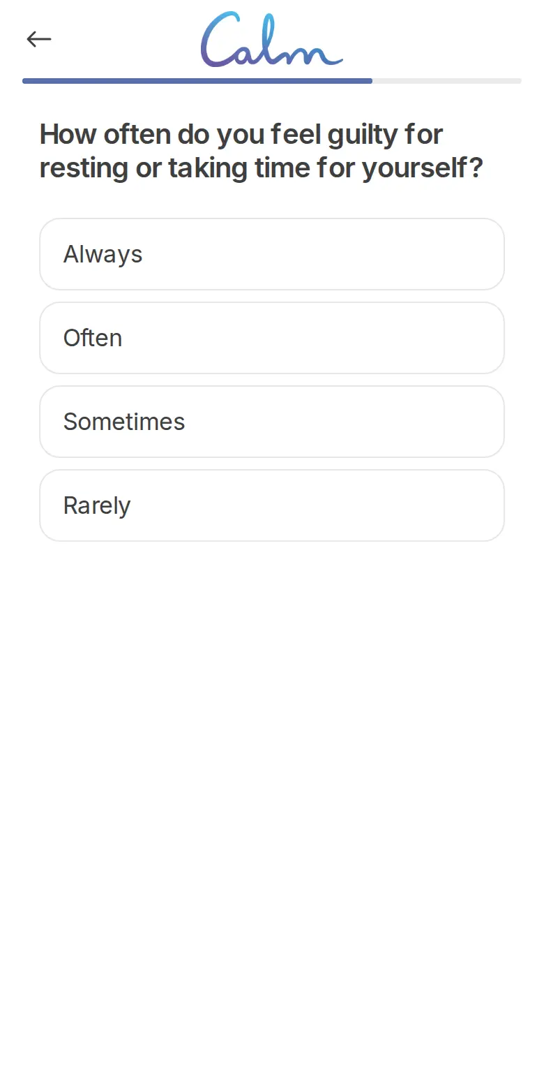
A ten-minute daily promise answers the busy-life objection. Local question counters give the long assessment shorter endpoints, and choosing a lesson time makes the routine concrete.
- 05
Start with a smaller paid decision
Three prices frame the same 14-day trial as a choice. Checkout then separates the selected €11 trial from the €99 three-month plan and brings the visitor’s goals back into view.
How to write a quiz funnel people want to finish
A useful quiz earns the next answer. It gives people a reason to start, shows how their answers change the recommendation, and lets them understand the offer before asking them to buy.
Start with the decision the visitor wants to make
“Find a routine that fits your week” tells someone what the quiz is for. Write that promise and the final recommendation together. Then ask which answers you need to connect them. A question belongs in the flow when it changes the result, explains its fit, or helps the visitor make a meaningful choice.
Make each question lead somewhere
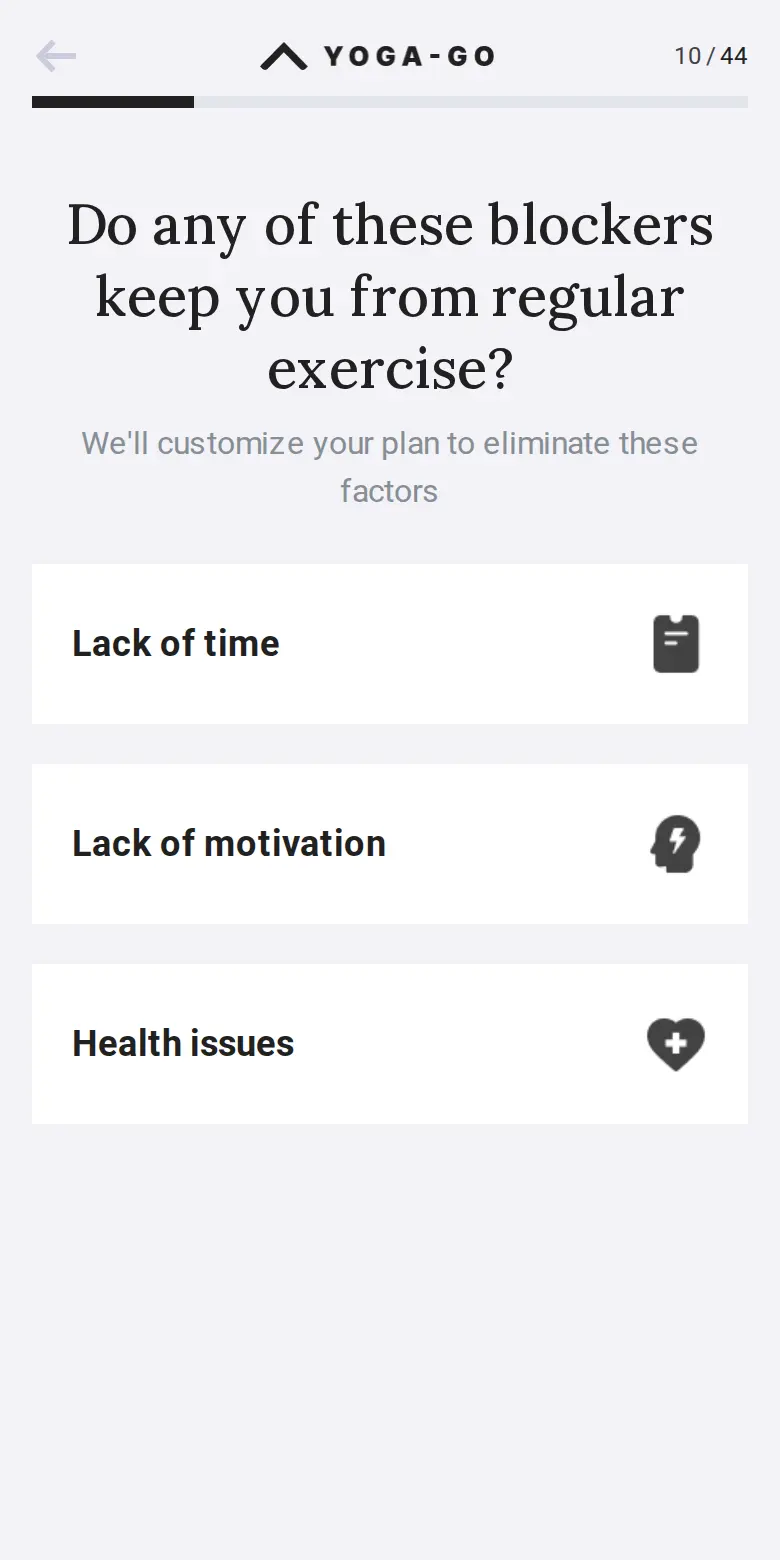
Use concrete choices about goals, constraints and preferences. Explain why you need sensitive information beside the question. When someone says time is a problem, show what the daily commitment looks like. That response makes the answer matter before the final result arrives.
For a longer quiz, group related questions into named sections with accurate progress. Keep the next endpoint clear. A short local counter should help people understand the remaining work, rather than conceal the total length.
Let the quiz demonstrate the product
A learning product can teach a small idea. A styling service can explain a useful fit choice. A planning tool can show how one preference changes the recommendation. Give the visitor something they can judge for themselves, instead of repeating claims about how personalized the product is.
Build the result from recognizable inputs. “You chose short sessions and no equipment, so start here” explains the recommendation. A first name on a generic result adds less useful information.
Treat the email gate as a testable choice
Decide what the email delivers: a saved result, a plan or a useful follow-up. Make the button describe that action. Showing the result before asking for email and gating it first are different hypotheses; neither arrangement is automatically better.
Compare the whole journey. An earlier gate may capture more addresses while losing people who would otherwise reach the offer. Keep optional marketing separate from receiving the requested result.
Make the price and the next step easy to evaluate
Carry the chosen goal and relevant benefits into the offer. Explain what is included, what is charged today, what happens after a trial, and how often the plan renews. Keep a monthly equivalent beside the actual billing total.
A trial lets people evaluate the service with a smaller initial commitment. Its terms still need to be understandable. Only use countdowns or limited bonuses when the stated conditions are real.
Measure purchases, not just completed quizzes
Track quiz starts, progress between sections, results viewed, email submissions, trials and purchases. Use purchases per quiz start alongside step-level completion. If trials renew, measure paid continuation and cancellations too; an appealing first charge can hide weak longer-term demand.
Use Slicer Competitor Watch to follow competitors’ funnels, ads and email sequences. Start with a specific pattern, write down why it might help your audience, then test it. For a different email-gate sequence, explore the BetterMe relationship quiz case study.