

User Journey Mapping for Product Teams: Templates and Slicer Audits
User Journey Mapping for Product Teams: Templates and Slicer Audits
A user journey map is a research-grounded visual story of a user's path to a goal, and you build one when you need to diagnose experience gaps or align teams on prioritised fixes. UX designers, product managers and digital experience teams use these maps to audit an existing product, pitch a future vision, or debug a single troublesome workflow. This guide walks through the components, the step-by-step method, a facilitator agenda and templates you can copy today.
TL;DR:
- A journey map should be based on evidence from interviews, analytics, or support logs, not internal assumptions, and focus on a single persona and scenario.
- Narrow maps for specific workflows are faster to produce and easier to act on than broad lifecycle maps, which reveal organizational ownership gaps.
- Stakeholder workshops should involve diverse team members and key evidence to co-create a reliable map, with a clear scope and stakeholder alignment beforehand.
- The map must include clearly owned pain points and opportunities, with confidence tags, to ensure they can be effectively addressed and validated through experiments.
- Once completed, journey maps need regular updates, ideally quarterly or semiannually, to stay relevant, and tools like Slicer can help rapidly prototype solutions after mapping.
Table of Contents
- What a journey map actually contains
- Which type of map fits your problem
- How to build a research-backed journey map step by step
- Running a workshop that produces a map worth keeping
- Choosing research methods that hold up under scrutiny
- Journey map examples worth stealing
- Where journey maps go wrong
- Turning the map into actual change
- Why evidence-first mapping and co-creation matter
- How Slicer helps once the map is drawn
- Sources
- FAQ
What a journey map actually contains
A journey map, as NN/g defines it, visualises the process someone goes through to accomplish a goal, laid out as a timeline of actions, thoughts, emotions, touchpoints and opportunities. Every useful map, regardless of format, carries the same backbone: a named actor or persona, a defined scenario or scope, a sequence of stages, and the touchpoints where the person interacts with your product or service at each stage.
Within each stage you record what the person does (actions), what they're thinking (ideally verbatim, pulled from an interview transcript), how they feel (emotion, often plotted as a line that rises and falls), where it hurts (pain points), and what you could do about it (opportunities). Each of these fields needs evidence behind it: a quote from an interview, a spike in a support log, a drop-off visible in analytics. A map built purely on internal opinion is a guess wearing a diagram's clothes.
Before you start drawing, confirm you have:
- A named persona and a single scenario, not a blended "everyone" journey.
- Defined stages, usually five to eight, that describe the journey chronologically.
- At least one evidence source per stage (interview note, analytics segment or support ticket).
- A thoughts and emotions layer, not just actions.
- Opportunity statements tied to specific pain points, not generic wishes.
Which type of map fits your problem
Not every project needs the same map. The first fork is scope: are you mapping a full lifecycle, from first awareness to renewal or churn, or a narrow slice like a single checkout flow? Broad maps suit strategic alignment and vision-setting; narrow maps suit fixing a specific, painful workflow fast. Trying to do both in one artefact usually produces something too vague to act on and too long to read in a meeting.
The second fork is state. Current-state maps document what happens today and are built from observed behaviour, which makes them strong for diagnosis but slower to produce because they demand real evidence. Future-state maps sketch an intended experience and are faster to draft, useful for rallying a team around a vision, but weaker as a change argument because they're aspirational by definition rather than evidence-backed.
- Current-state map: grounded in real behaviour, best for finding and prioritising fixes, but requires research time upfront.
- Future-state map: fast to sketch, good for vision alignment, but risks becoming wishful thinking without a current-state companion.
- Narrow workflow map: five to eight stages on one task, ideal when you already know where the pain lives.
- Broad lifecycle map: spans the full relationship, useful for strategy but harder to action directly.
If your real question is about the mechanics behind the scenes rather than the person's experience, a service blueprint is the better tool: it adds the backstage processes, systems and staff actions that produce the frontstage experience the journey map describes. If your question is narrower still, "what screens does the user tap through", a simple user flow will do the job with far less overhead. Journey maps, service blueprints and user flows solve different problems, and picking the wrong one wastes a workshop's worth of goodwill.
How to build a research-backed journey map step by step
Start by deciding scope: pick one persona and one scenario. Resist the urge to map "the whole customer base" in a single pass, because a map trying to represent everyone ends up representing no one precisely.
Next, choose your approach. NN/g's research on practitioner behaviour found that many teams begin with a hypothesis-first workshop, sketching the journey from what the team already believes, then validate with targeted research afterwards. That order works well when you need to buy stakeholder engagement quickly. A research-first approach, where you gather evidence before drawing anything, takes longer but produces a map you can defend in a budget meeting. Many mature teams combine both: hypothesis first to align the room, research second to correct it.
- Gather evidence. Run 5 to 12 interviews for a focused scope, per the sample-size guidance from Great Question's research on journey mapping; use diary studies instead when the journey unfolds over days or weeks rather than a single session. Pull supporting analytics slices and scan support logs for recurring language.
- Lay out the stages. Sequence the journey chronologically based on what the evidence actually shows, not on how your product's navigation is structured.
- Add actions and touchpoints. For each stage, note what the person does and where they do it: an app screen, an email, a phone call, a physical location.
- Layer in thoughts and emotions. Use verbatim quotes wherever you have them, and assign emotion with a simple label or a plotted line, alongside a confidence tag so readers know which parts are well-evidenced and which are still assumptions.
- Write opportunity statements. Tie each one to a specific pain point and evidence source, then prioritise by impact against feasibility rather than by whoever argued loudest in the room.
Pro Tip: Label every stage with a confidence tag (high, medium, low) based on how much real evidence backs it. It stops a beautifully designed guess from being treated as fact three months later.
Running a workshop that produces a map worth keeping
A journey map built by one person in isolation rarely survives contact with a roadmap review. The #TiSDD method for co-creative mapping recommends including people with direct knowledge of the experience, meaning frontline staff or customers themselves, not just the product team guessing on their behalf. Aim for three to twelve participants: designers, a product manager, support or sales staff, and at least one engineer who'll have to build the fix.

Circulate pre-work before the session: a short research summary, the persona brief, and any existing analytics that hint at where the journey breaks down. Walking in cold wastes the room's time re-deriving what a five-minute read could have covered.
A workable agenda for a half-day session:
- Align on scope (15 minutes). Confirm the persona, scenario and stage count before anyone reaches for a marker.
- Map the stages (30 minutes). Following the #TiSDD technique, split into small groups of three to five to draft sub-maps independently, then merge them and reconcile any disagreements openly rather than smoothing them over.
- Add emotions and pain points (30 minutes). Layer feeling and friction onto the merged map.
- Dot-vote the pain points (15 minutes). Everyone gets a fixed number of votes to spend on the issues that matter most.
- Generate opportunities (30 minutes). For each top-voted pain point, draft two or three possible responses.
- Build the action plan (20 minutes). Assign an owner and a next step to each prioritised opportunity, plus a rough validation plan.
Document outputs the same day: owners, dates and a short validation note per item, following the practical workshop advice from Ideaplan on converting a session into action rather than "shelf-ware". Schedule a follow-up review in four to six weeks to check progress against the roadmap, or the map quietly becomes wallpaper.
Choosing research methods that hold up under scrutiny
Different methods answer different questions, and mixing them well is what separates a defensible map from a decorative one. Interviews surface language, motivation and the "why" behind a behaviour; usability testing shows where people actually stumble in the moment; analytics reveal scale and where drop-off concentrates; support tickets flag recurring complaints you might otherwise never hear directly.
- Use interviews when you need the reasoning behind a decision, not just the click path.
- Use diary studies for journeys that unfold over days or weeks, where memory alone would distort a retrospective account.
- Use analytics to confirm whether a pain point you heard about in three interviews is actually widespread.
- Use support logs to catch issues customers report but rarely mention unprompted in research sessions.
A focused sample of 5 to 12 interviews often provides actionable insight for a narrow-scope journey, though longer or more complex journeys benefit from diary studies rather than a single retrospective conversation. Label each stage's confidence level so stakeholders know which parts rest on solid ground.
Journey map examples worth stealing
A narrow onboarding map for a SaaS sign-up flow, covering account creation through to first successful action, typically reveals one thing clearly: the gap between "account created" and "value delivered" is where most emotional dips concentrate. A team mapping this often finds that a single confusing settings screen accounts for a disproportionate share of the drop-off, something no one on the internal team had flagged because they'd long since memorised the workaround.
A broad lifecycle map, running from first awareness through to renewal or churn, tends to reveal something structural instead: ownership gaps. The marketing team owns awareness, product owns onboarding, support owns the mid-life relationship, and no one owns the handoffs between them. That's usually where the map earns its keep by making an invisible organisational seam visible on paper.
Whichever scale you're working at, a reusable template for each stage keeps the exercise consistent.
- Action: what the person does at this point.
- Touchpoint: where the interaction happens.
- Thought: a verbatim quote if you have one.
- Emotion: a label or a point on a plotted line.
- Evidence source: interview, analytics, support log.
- Owner: who's accountable for improving this stage.
- Confidence: high, medium or low, based on how solid the evidence is.
Where journey maps go wrong
Most failed maps share the same handful of causes, and each has a straightforward fix.
- No defined scope or persona. Fix it by naming one persona and one scenario before the first sticky note goes up.
- Built entirely on internal assumptions. Fix it by validating with real interviews, diary studies or analytics before treating the map as final.
- Trying to be exhaustive. Keep it to five to eight stages; a forty-stage map helps no one make a decision.
- Pain points with no owner. Every pain point needs a named owner and a next step, or it dies quietly on a slide.
- Accessibility bolted on late. Integrating accessibility considerations early prevents costly late-stage fixes and surfaces workarounds that conventional mapping often misses entirely.
Turning the map into actual change
A map that never leaves the workshop room hasn't done its job. The point is converting insight into a testable plan.
- Write testable opportunity statements with a stated outcome measure, not just a description of the problem.
- Select one to three experiments from the prioritised list, and define the metric that will tell you whether each one worked.
- Build a validation plan: a follow-up interview round, an A/B test, or an analytics check, with a realistic timeline attached.
- Set a revisit cadence. Quarterly reviews suit fast-moving products; twice a year is often enough for slower, more stable services.
Maps age. A journey mapped before a redesign, a pricing change or a new competitor's launch stops reflecting reality fast, so the cadence matters as much as the initial workshop.
Why evidence-first mapping and co-creation matter
The teams that get real value from journey mapping are the ones willing to be corrected by evidence rather than defending the first sketch drawn on a whiteboard. Co-creation isn't a nicety, it's what stops a map from quietly encoding one team's blind spots as fact. Building accessibility into the mapping process from the start, rather than retrofitting it after launch, tends to save far more rework than it costs upfront.
— Daumantas
How Slicer helps once the map is drawn
Once your journey map has flagged the touchpoints that hurt, the next question is usually practical: what's actually broken there, and how fast can you prototype a fix? Slicer combines AI-powered website audits with hands-on UI exploration in one workflow, so you can move from a mapped pain point to a working fix without switching between five different tools.
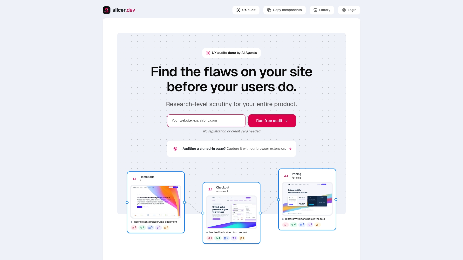
- Run a UX audit on the highest-priority touchpoint your map surfaced, and Slicer explains what's wrong and why, covering UX, UI, usability and accessibility issues.
- Copy the component causing the friction directly from a live competitor or reference site, capturing its layout, styling and interactions, and turn it into a clean React component or an AI-ready prompt.
- If you're prototyping inside Cursor, Bolt or v0, Slicer exports the copied component in a format each of those environments can use directly.
If your journey map pointed at a specific onboarding screen or checkout step, that's exactly the kind of touchpoint worth auditing first. Slicer offers tiered subscription plans suitable for teams running audits and component exports regularly. Have a look at the plans on Slicer's site to find the one that matches how often your team ships fixes.
Sources
This guide draws on NN/g's foundational research on what a journey map is and how practitioners build them, Atlassian's stepwise playbook for running the process end to end, and #TiSDD's method notes on co-creative workshop facilitation. The accessibility-focused workshop guide is worth a full read for anyone building inclusive mapping practice into their process from day one, and Yale's usability team offers a clear teaching reference for the core components covered above.
- Journey Mapping 101 - NN/g
- #TiSDD method: Co-creating journey maps
- Accessibility user-journey mapping workshop
FAQ
What's the difference between a journey map and a service blueprint?
A journey map shows the user's experience: their actions, thoughts and emotions across stages. A service blueprint adds the backstage layer, the systems, staff and processes producing that experience, making it the better tool when the problem lives behind the scenes rather than in front of the user.
How many interviews do I need before mapping a journey?
A focused, narrow-scope journey typically needs 5 to 12 interviews to surface actionable patterns. Longer or more complex journeys benefit from diary studies instead, since memory alone tends to distort a retrospective account of a multi-week process.
Should I start with a hypothesis or with research?
Many practitioners start hypothesis-first to align a team quickly, then validate with targeted research afterwards. A research-first approach takes longer but produces a map that holds up better under scrutiny, and combining both is common in mature teams.
How often should a journey map be updated?
There's no universal rule, but quarterly reviews suit fast-moving products, while twice a year often works for more stable services. Any major redesign, pricing change or new competitor should trigger an earlier review regardless of the usual cadence.
Can Slicer replace the journey-mapping process itself?
No. Slicer helps after the mapping work is done, running fast UX audits on the touchpoints a map has flagged and letting you copy real UI components to prototype fixes quickly. The mapping, research and prioritisation described in this guide still need to happen first.
Recommended
- How to use Slicer with Cursor
- How to copy a UI component from any website
- How to use Slicer with Claude Code
Daumantas Banys, founder of slicer.dev


