

Designers: Accessibility First Microinteractions for UX
Designers: Accessibility First Microinteractions for UX
A microinteraction is a single-purpose exchange between a trigger and a response: you tap a button, the interface tells you what happened. Get this right and you clarify system status, stop errors before they cost the user time, and add a layer of engagement that makes a product feel considered. The rule of thumb is simple: add one only when it communicates something the user needs, or lets them undo a mistake.
What are microinteractions?
A microinteraction is a contained loop: something triggers it, the system responds, and the loop closes. Toggle a switch and it slides with a colour change. Pull to refresh and a spinner confirms the system heard you. Each of these does one job and stops. That single-purpose constraint is what separates a microinteraction from a flow: a checkout process has dozens of steps and multiple goals, but a “like” button has exactly one.
Triggers come in two flavours. User-triggered microinteractions respond to a deliberate action, such as tapping a heart icon or dragging a slider. System-triggered ones fire without direct input, such as a low-battery warning or a notification badge appearing after a background sync. Both need to be legible at a glance, but system-triggered ones carry a heavier burden: the user did not ask for the interruption, so it has to earn its place.
The designer Dan Saffer gave this space its most widely used organising model, splitting every microinteraction into four parts: trigger, rules, feedback, and loops and modes. It is worth learning this framework early, because it turns a vague design instinct (“this needs some polish”) into a specification you can hand to an engineer. The Nielsen Norman Group’s primer on microinteractions frames the same idea from a different angle: these are trigger and feedback pairs that should stay single-purpose, because a microinteraction trying to do three things at once usually does none of them well.
Static UI shows state. A microinteraction shows change, and change is what people actually notice. A button that is simply blue tells you nothing new; a button that turns blue when you press it tells you the system registered your action. That distinction, between showing and confirming, is the entire reason this category of design exists.
The four components: trigger, rules, feedback, loops and modes
Saffer’s framework holds up because each part maps to a question you can ask during a design review.

The trigger starts the interaction, and it is either a user action (a tap, a swipe, a keystroke) or a system event (a timer expiring, data arriving). Ask: is it obvious what caused this to happen? If a user cannot trace cause to effect, the trigger has failed regardless of how nice the animation looks.
The rules define what happens once the trigger fires: what changes, in what order, and what the boundaries are. A star rating widget has rules about how many stars can be selected, whether half-stars are allowed, and what happens if you tap the same star twice. Ask: are the rules consistent with how similar controls behave elsewhere in the product?
The feedback tells the user the rules were applied: a colour shift, a sound, a haptic buzz, copy that appears and disappears. Ask: is the feedback close to the point of action? Feedback that appears far from where the user is looking, a toast notification in a corner while they tapped something in the middle of the screen, often goes unseen.
Loops and modes govern repetition and exceptions. A loop is what happens if the same trigger fires again, like a “like” button that unlikes on a second tap. A mode is a rule change under specific conditions, such as a save button that becomes a “saved” confirmation for two seconds before reverting. Ask: does this microinteraction need a loop at all, or is a one-shot response enough? Adding loop logic to something that only ever happens once is a common way to over-engineer a simple pattern.
Why microinteractions matter: core UX benefits
The strongest case for microinteractions is that they answer a question the user is already asking: did that work? A progress bar during a file upload does not just look nice, it answers “is this stuck?” before the user has to wonder. Without it, people either wait too long out of uncertainty or abandon a process that was actually fine.
Error prevention is the second major benefit. Inline validation, a red border and a short message appearing the moment an email field is malformed, catches mistakes at the point they happen rather than after a form submission fails. This is cheaper for the user than a page reload and a generic error banner, and it is one of the clearest returns on a small design investment.
The third benefit is softer but real: engagement and brand tone. A celebratory animation when someone completes a first task, or a distinctive sound when an order confirms, gives a product a personality that a plain success message cannot. According to the IxDF’s overview of microinteractions in UX, these small elements make routine tasks feel more enjoyable and can increase engagement when they are purposeful and consistent with the product’s tone.
None of this is free, though. Motion can distract from the actual task, it can trigger discomfort for users with vestibular sensitivities, and every added animation is a small performance cost on lower-end devices. The W3C’s guidance on animation from interactions exists precisely because interaction-triggered motion can provoke real physical reactions, which is why every microinteraction you add should also be one you can justify removing.
Best practices for designing microinteractions
Treat every microinteraction as a single decision with a single job, and resist the urge to add motion just because a component looks static without it. Decorative animation with no informational purpose is the fastest way to bloat an interface and slow it down.
Timing matters more than most designers expect. Feedback that appears too fast can feel like nothing happened; feedback that lingers too long feels sluggish.
-
Keep most feedback animations between 100 and 300 milliseconds so they register as instant without feeling like a delay.
-
Use loop or state animations, such as a spinner, for anything expected to take longer than a second.
-
Favour ease-out curves for elements entering the screen and ease-in for elements leaving, since abrupt starts and stops read as mechanical.
-
Match your motion language to your existing design system rather than inventing a new easing curve for every component.
Consistency across a product is what makes a microinteraction feel like part of the interface rather than a novelty. If one button press has a gentle bounce and another snaps instantly, the product feels unfinished even if each animation is well made individually.
Accessibility has to be built in from the start, not patched on afterwards. The W3C’s technique for using prefers-reduced-motion describes exactly this: suppress non-essential interaction-triggered motion for anyone who has told their operating system they prefer reduced motion, and provide a JavaScript fallback where the CSS query alone will not cover the behaviour. Keyboard operability and screen-reader announcements matter just as much as the visual layer.

On performance, animate transform and opacity wherever possible rather than properties that force the browser to recalculate layout, such as width, height or top. A microinteraction that causes visible jank undoes the polish it was meant to add.
Pro Tip: Prototype the feedback state before you prototype the trigger. If the feedback alone does not clearly communicate what happened, no amount of trigger polish will fix it.
Practical examples and common patterns
Some patterns recur across almost every interface because they solve problems every product has. Here are the ones worth knowing, what to copy from them, and where they go wrong.
-
Instant feedback controls. Toggles, pressed states and like or favourite buttons confirm an action the moment it happens, usually through colour change and a small scale animation. Copy the pattern of immediate, local feedback within 100 to 300 milliseconds; avoid adding a loading state to something that should be instantaneous.
-
Progress indicators and waiting states. Spinners, progress bars and skeleton screens answer “is this working?” during anything that takes more than a second or two. The tradeoff is that a spinner with no percentage tells the user nothing about how much longer to wait, so a determinate progress bar is worth the extra engineering effort whenever the duration is knowable.
-
Inline validation and undo. Real-time field validation catches errors before submission, and an undo action after a delete gives users a safety net instead of a confirmation dialogue that interrupts flow. The undo pattern in particular tends to outperform “are you sure?” modals because it does not stop the user’s momentum.
-
Onboarding hotspots and attention cues. A pulsing dot pointing at a new feature, or a brief tooltip on first use, can genuinely help discovery when it appears once and disappears permanently. The common mistake is leaving these cues active indefinitely, which turns a helpful nudge into a permanent irritation.
-
Achievements and celebratory moments. Confetti on completing a first project or a badge on hitting a milestone can build genuine engagement when tied to something the user actually cares about. They distract when they interrupt a task the user was trying to finish quickly, so reserve them for genuine milestones rather than routine actions.
The pattern behind every one of these is the same: match the weight of the feedback to the weight of the action. A one-tap toggle needs a flicker of colour, not a full-screen animation, and a genuine milestone deserves more than a two-pixel colour shift.
How to design, prototype and test microinteractions
A microinteraction earns a place in a design system by going through the same rigour as any other component, just at a smaller scale.
-
Scope it with acceptance criteria. Write down the trigger, the expected feedback, the timing, and what “done” looks like before opening a design tool. If you cannot state the single job this interaction does, it is not ready to design.
-
Prototype the feedback state first. Tools like Figma’s smart animate, Principle or Framer let you build the trigger-to-feedback loop quickly; specify exact durations, easing curves and any reduced-motion variant so engineers are not left guessing.
-
Test with a task, not a demo. Give users a real task that requires noticing the feedback, such as completing a form with a deliberate error, and watch whether they notice the validation message without being told to look for it. Track completion time, hesitation and whether users understood the state change; also test with the operating system’s reduced-motion setting enabled to confirm the interaction still communicates its point.
-
Decide: ship, iterate or remove. If users consistently miss the feedback or find it distracting, it needs a redesign rather than a defence. An interaction that adds visual noise without changing user behaviour or understanding should be cut, not polished further.
Implementation notes: technical and accessibility details
The design intent behind a microinteraction only survives if the build respects a handful of technical constraints.
-
Use the
prefers-reduced-motionCSS media query to suppress non-essential animation for users who have requested it at the operating system level, and add a JavaScript check as a fallback where the CSS alone cannot cover a behaviour, exactly as described in the W3C’s technique documentation. -
Animate
transformandopacityrather than layout-triggering properties such aswidthortop, since the former run on the compositor thread and avoid forcing the browser to recalculate the page. -
Manage focus deliberately: when a microinteraction changes content (a new message appears, a field becomes invalid), move or announce focus so keyboard and screen-reader users are not left behind.
-
Use ARIA live regions for feedback that appears without a corresponding user action nearby, such as a background save confirmation, so assistive technology announces the change without the user having to search for it.
-
Test on genuinely low-end devices rather than only on a development machine, since a smooth 60 frames per second locally can drop noticeably on older hardware.
Reproducing an existing site’s motion accurately, rather than approximating it by eye, is one of the more tedious parts of this work; a walkthrough on extracting CSS and animations from a live website covers the practical steps for pulling exact timing and easing values instead of guessing them.
Designer perspective: when to favour microinteractions and when to avoid them
The honest tension in this work is that delight and distraction come from the same toolbox. A well-placed animation builds trust in a product; the same animation, placed one step too early or repeated once too often, starts to feel like noise the user has to work around.
My own heuristic for prioritising these on a roadmap is to rank by consequence: fix anything that leaves users unsure whether an action succeeded before touching anything purely decorative. A missing loading state costs more trust than a missing celebration ever will. Watch production usage closely once something ships, because the interaction that tested well with five people in a lab can behave very differently at scale, especially around performance on older devices.
— Daumantas
How Slicer helps teams audit, prototype and extract interactive components
Spotting a broken or missing microinteraction across a live product is slower than it should be when you are relying on manual click-throughs. Slicer runs an AI-powered audit across a website’s user journeys and surfaces exactly where the UX, usability or accessibility gaps sit, including the moments where feedback is missing or unclear, with an explanation of why each one matters.
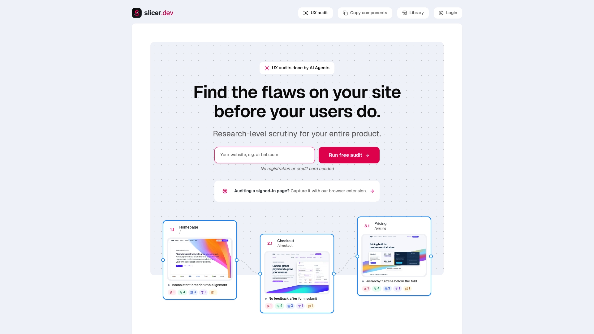
Once you have found an interaction worth borrowing, the harder problem is usually reproducing it faithfully rather than approximating it from a screenshot. Slicer’s component copying feature captures a live UI component’s layout, styling and interactive behaviour directly from any website, then exports it as clean React code or an AI-ready prompt your team can drop straight into a build.
-
Run an audit to find where system status, error handling or feedback is missing across a real user journey.
-
Copy a working microinteraction from any live site and export it as React code or a prompt, rather than rebuilding it from a video recording.
-
Use the Slicer for v0 or Slicer for Cursor integrations if your team already builds with AI-assisted code generation.
The Free plan is a good place to see how the audits read before committing to anything. Current pricing details for paid tiers and features are available on the Slicer website. Start at Slicer or head straight to the component copying page to try it against a site you already admire.
Sources
For the accessibility rules behind interaction-triggered motion, read the W3C’s Success Criterion 2.3.3 on animation from interactions and its companion technique for prefers-reduced-motion. For the foundational design definition, Nielsen Norman Group’s primer on microinteractions remains the clearest starting point, alongside the IxDF’s practical overview for pattern examples.
FAQ
What are some examples of microinteractions?
Common examples include a toggle switch changing colour when tapped, a “like” button animating on press, a pull-to-refresh spinner, inline form validation, and a progress bar during a file upload. Each follows the same trigger-and-feedback structure regardless of how simple or elaborate the animation is.
Is UX/UI design an oversaturated field?
Demand and competition vary a great deal by market and specialism, and no single figure captures the whole field accurately. What tends to separate designers regardless of market conditions is fluency with the practical details, including microinteractions, accessibility and prototyping skills that go beyond visual layout.
What are the core pillars of UX design?
Definitions vary across sources, but most cover usability, accessibility, findability, desirability, credibility and value, often alongside usefulness. Microinteractions touch several of these directly, particularly usability and desirability, since they shape how clear and how pleasant an interface feels to use.
Will AI replace UX/UI designers?
AI tools are changing parts of the workflow, particularly prototyping and code generation, but they do not replace the judgement needed to decide what a product should communicate and when. Tools like Slicer are built to speed up specific tasks, such as auditing a journey or extracting a component, rather than to replace the design decisions behind them.
Recommended
Daumantas Banys, founder of slicer.dev


