

Ship Fixes Faster: UX Audit Checklist With Two Pass Scoring and Core Web Vitals
Ship Fixes Faster: UX Audit Checklist With Two Pass Scoring and Core Web Vitals
A UX audit checklist produces a ranked, evidence-backed list of UX issues and the fixes your team should tackle first. It draws on three inputs: quantitative metrics, a structured heuristic review, and qualitative user research. The end deliverable isn't a report nobody reads. It's a prioritised backlog with owners, annotated screenshots, and a measurement plan to prove the fixes worked.
TL;DR:
- Core Web Vitals thresholds are set at the 75th percentile and should be a primary focus for diagnosing user experience issues.
- Prioritization relies on scoring issues by severity and impact, then applying an impact-effort framework to create a manageable backlog.
- Combining heuristic evaluation with real user testing enhances accuracy, with three to five evaluators producing more comprehensive results.
- Automating initial scans with tools like Slicer can surface likely issues quickly, saving human effort for severity assessment and component extraction.
- A well-structured report divides findings into executive summary, detailed journey-based issues, and actionable recommendations with clear ownership.
Table of Contents
- The ux audit checklist: a step-by-step workflow
- Which quantitative metrics should you collect first?
- Heuristic evaluation checklist mapped to Nielsen's principles
- Qualitative research: finding out why the numbers look wrong
- Scoring issues with a two-pass, impact-times-effort model
- Turning findings into a report stakeholders will act on
- How Slicer speeds discovery and handover
- What experienced auditors get wrong most often
- Where Slicer fits into your audit toolkit
- Standards worth bookmarking
- Sources
- FAQ
The ux audit checklist: a step-by-step workflow
Most audits fail before they start, not because the reviewer misses issues, but because nobody defines what "done" looks like. Here's the working sequence that produces a backlog engineers will actually pick up.
-
Define scope and objectives. Pick the business KPIs you're trying to move (checkout conversion, sign-up completion, support ticket volume), name the user segments involved, and map the two or three journeys that matter most. Auditing an entire site with no scope produces a report nobody can act on.
-
Prepare your data before you open a single screen. Pull analytics for the scoped journeys, pull Real User Monitoring (RUM) or Chrome UX Report data if it's available, and check that event tracking actually maps to the steps in your funnel. Half the audits I've seen skip this step and end up debating opinions instead of numbers.
-
Run a screen-by-screen heuristic pass. Walk every screen in the scoped journey against a fixed checklist (covered in detail below) and note anything that violates a heuristic, however small. Don't filter yet, just capture.
-
Layer in qualitative evidence. Watch session replays for the journeys in scope, run a handful of moderated usability tests, and deploy an intercept survey if you need intent data at scale. This is where you find out why the metrics look the way they do.
-
Synthesise everything into themes. Cluster individual observations into patterns (three separate replays showing users missing the same button is one issue, not three), then map each theme back to the metric it's likely affecting.
-
Prioritise using severity, impact, and effort. Score every issue, rank the list, and separate quick wins from larger structural fixes.
-
Build the execution plan. Assign owners, attach rough effort estimates, and write acceptance criteria so engineering knows exactly what "fixed" means.
-
Set the follow-up cadence. Decide which metrics you'll re-check and when, typically two to four weeks after a fix ships, then schedule the next audit before you forget to.
That sequence works whether you're auditing a five-screen onboarding flow or a full e-commerce checkout. The scope changes; the order doesn't.
Which quantitative metrics should you collect first?
Numbers tell you where to look before you spend a day staring at screens. Skipping this step means you're auditing based on hunches, and hunches are expensive when they're wrong.
- Core Web Vitals, measured at the 75th percentile: Largest Contentful Paint (LCP) at 2.5 seconds or under, Interaction to Next Paint (INP) at 200 milliseconds or under, and Cumulative Layout Shift (CLS) at 0.1 or under. These thresholds were chosen for achievability across real-world conditions, not as arbitrary targets, so treat a page that fails them as a genuine friction point, not a rounding error.
- Funnel and task completion rates for every step in the scoped journey, so you can see exactly where users abandon.
- Event-level timings on key interactions (form submission, search, add-to-cart) to catch slow responses that don't show up in aggregate page metrics.
- Conversion rate by segment, since a metric that looks fine in aggregate can hide a broken experience for mobile users or a specific region.
Statistic Callout: Core Web Vitals thresholds are set based on the 75th percentile of page loads, meaning a substantial majority of your real users need to meet the targets before Google (and your users) consider the experience acceptable.
Use field data from RUM or CrUX for real-world context, paired with Lighthouse or Chrome DevTools for lab diagnosis once you've spotted an anomaly. Field data tells you something is wrong; lab tools tell you why. When a metric anomaly turns up, cross-reference it against the journey map from step one and prioritise pages that carry the most user or revenue weight, not just the pages with the worst numbers.
Heuristic evaluation checklist mapped to Nielsen's principles
Jakob Nielsen's 10 usability heuristics remain the most reliable framework for a structured interface review, largely because they're broad enough to apply to any interface and specific enough to generate concrete checks. Here's how to turn each one into something you can actually tick off:
- Visibility of system status: Does every action produce feedback? Check for loading indicators, progress states, and confirmation messages after form submission.
- Match between system and the real world: Does the language match how users actually describe things, not internal jargon?
- User control and freedom: Is there an obvious way to undo, cancel, or back out of a flow without losing progress?
- Consistency and standards: Do buttons, icons, and terminology behave the same way across every screen in the journey?
- Error prevention: Are destructive actions confirmed, and are form fields validated before submission rather than after?
- Recognition rather than recall: Are options visible, or does the interface expect users to remember information from a previous screen?
- Flexibility and efficiency of use: Are there shortcuts for repeat users without punishing first-time visitors?
- Aesthetic and minimalist design: Is every element on the screen earning its place, or is it competing for attention with the primary task?
- Help users recognise, diagnose, and recover from errors: Are error messages specific and written in plain language, with a clear next step?
- Help and documentation: Is support findable at the point of need, not buried three clicks deep?
Run this with three to five evaluators independently before comparing notes. Independent evaluation followed by synthesis catches more issues than a single reviewer or a group review from the start, since different evaluators consistently spot different problems. Timebox each evaluator to one or two hours per scoped journey, and use a shared template (screen, heuristic violated, severity, screenshot) so results are easy to merge.
Qualitative research: finding out why the numbers look wrong
Metrics and heuristics tell you what's broken and roughly where. They rarely tell you why a user gave up halfway through a form. That's what qualitative research is for, and skipping it is the single most common shortcut that turns an audit into a guessing exercise.
- Session replays and heatmaps surface recurring friction, rage clicks, dead clicks, and users repeatedly scrolling past a call to action they should have seen immediately.
- Short moderated usability tests (five to eight participants per segment is usually enough to spot patterns) let you validate a specific hypothesis from the heuristic pass rather than running an open-ended exploration.
- Intercept surveys placed at the point of abandonment capture intent data you can't get from behavioural tools alone, particularly useful when a user recovers from an error and you want to know what almost stopped them.
- Sampling should track the critical journeys and personas defined in scoping, not just whoever's easiest to recruit.
Heuristic evaluation is efficient at catching problems early, but it should always be paired with actual user testing, since evaluators and real users consistently flag different issues. Treating a heuristic checklist as a substitute for watching real people struggle is where most audits quietly lose their credibility.
Pro Tip: Record the exact task phrasing you gave participants alongside each finding in your notes. Six months later, when someone questions whether a "confusing checkout" finding still applies, you'll want to know precisely what you asked them to do.

Scoring issues with a two-pass, impact-times-effort model
The reason most audit reports gather dust is simple: they list every issue with equal weight, and nobody knows where to start. A two-pass approach separates observation from judgement, which keeps early-stage bias out of your findings and produces a backlog people can actually work from.
- First pass, capture everything. Record every potential issue from the heuristic review and qualitative research without filtering. Nothing gets dismissed at this stage, even the small stuff.
- Second pass, score severity and impact. Rate each issue on how badly it affects the user (cosmetic, moderate, severe, blocker) and how much business value the affected journey carries.
- Apply an impact times effort framework. A RICE-style score (reach, impact, confidence, effort) or a simple two-by-two grid works fine, just be consistent across every item.
- Map each item to a metric. State explicitly which number you expect to move (conversion rate, INP, task completion) so success is measurable, not vague.
- Produce three deliverables: a ranked backlog, a quick-wins list your team can ship this sprint, and a set of engineering-ready tickets with acceptance criteria attached.
This is also where benchmarking against competitors and industry standards earns its place, since it tells you whether an issue is a genuine product flaw or a pattern common across the market that users have already adapted to.
Turning findings into a report stakeholders will act on
A UX audit report that gets ignored is worse than no audit at all, because it burns the team's appetite for the next one. Structure it in three parts: an executive summary (the two or three headline findings and their business impact, one page, no jargon), the detailed findings section (organised by journey, not by heuristic, since stakeholders think in flows), and recommendations with named owners, rough effort estimates, and a re-measure date.
Visuals do more work than prose here. Annotated screenshots with numbered callouts, heatmap overlays showing where attention actually goes, and a severity map (a simple grid plotting issues by impact and effort) communicate faster than a paragraph ever will. A trend chart showing Core Web Vitals or conversion rate over the past few months gives executives the "why now" without you having to argue for it.
Statistic Callout: Core Web Vitals are measured at the 75th percentile, segmented by device, so your trend chart should split mobile and desktop rather than blending them into one misleading average.
Tailor the language, not the facts, per audience: engineers want the acceptance criteria and reproduction steps, product managers want the effort-versus-impact ranking, executives want the business metric and the date you'll report back.
How Slicer speeds discovery and handover
A two-pass workflow works even better when automation handles the first sweep. Run an automated scan to surface candidate issues across UX, UI, usability, and accessibility, then have a human evaluator validate severity and business relevance before anything reaches the backlog.
- Automated scans flag likely issues fast, so human time goes toward judgement calls, not screen-by-screen hunting.
- Copying components directly from a live site captures layout, styling, and interaction behaviour, not just a flat screenshot, which matters when a fix needs to reproduce the original component's responsive behaviour.
- Audit artefacts that include extractable components alongside annotated findings cut the back-and-forth between design and engineering during handover.
What experienced auditors get wrong most often
The biggest failure mode isn't missing issues, it's drowning stakeholders in an unprioritised wall of forty findings with no sense of what matters. Two-pass scoring exists precisely to prevent that. The second mistake is treating heuristic evaluation as a complete substitute for watching real users struggle. It never is. Developer-ready outputs, meaning components and annotations engineers can act on immediately, are what separate an audit that ships fixes from one that sits in a shared drive.
— Daumantas
Where Slicer fits into your audit toolkit
Slicer combines AI-powered website audits with hands-on UI exploration in a single workflow, which matters once you've lived through the alternative of juggling three separate tools for scanning, screenshotting, and component extraction. It analyses user journeys to flag UX, UI, usability, and accessibility issues, then lets you copy the actual components involved and turn them into AI-ready prompts or clean React code for the fix.
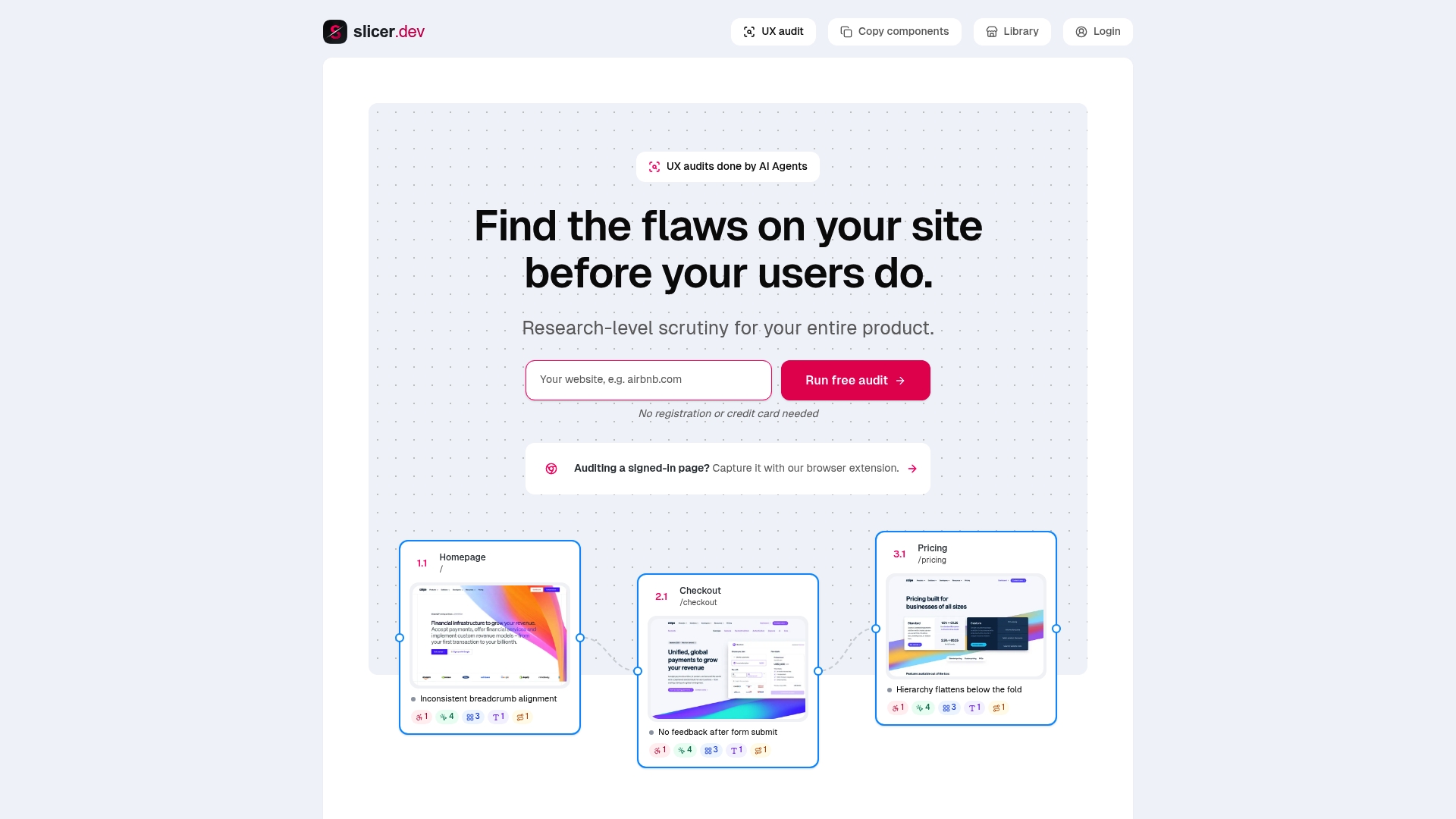
That combination is the practical difference: you don't just get a list of what's wrong, you get the working component to build the fix from. Teams doing their first audit can start on a free plan, and paid tiers vary in features and pricing, scaling with how many pages and components need processing; current details are available on the provider's website. If you're running your next audit and want to see how the audit and component-copy workflow handles your own site, that's the place to start.
Standards worth bookmarking

Keep these on hand rather than relying on memory during a review. Nielsen's 10 usability heuristics remain the fastest way to structure an interface walkthrough. The WCAG quick reference lays out success criteria by principle, useful when you need the exact technique behind an accessibility flag. web.dev's Core Web Vitals guidance covers thresholds and measurement methodology. Baymard's benchmarking commentary is worth reading before you decide whether an issue is unique to your product or common across the category.
FAQ
What Should a UX Audit Checklist Include?
A UX audit checklist should cover scope definition, quantitative metrics (Core Web Vitals, funnel data), a heuristic review against Nielsen's 10 heuristics, qualitative research, and a two-pass prioritisation step. The output is a ranked backlog, not a raw list of observations.
How Long Does a UX Audit Typically Take?
Timing depends on scope, but a single critical journey (checkout, onboarding) typically takes one to two weeks including heuristic review, a handful of usability tests, and report writing. Auditing an entire site takes considerably longer and is usually better split into phases by journey.
How Many Evaluators Should Run a Heuristic Evaluation?
Three to five independent evaluators is the practical range, since different evaluators consistently catch different issues and synthesising their notes afterward catches more than any single reviewer would alone. Fewer than three tends to miss too much; more than five adds diminishing returns for the extra coordination.
What Tools Can Automate Part of a UX Audit?
Automated scanning tools can flag candidate UX, UI, usability, and accessibility issues before a human reviewer validates severity, which speeds up the first pass considerably. Slicer runs this kind of automated scan and also lets you copy the flagged components directly into AI-ready prompts or React code, with plans starting free and paid tiers from $15 a month at Slicer.
How Do You Prioritise UX Issues After an Audit?
Score each issue on severity and business impact during a second pass, after capturing everything unfiltered in the first pass, then rank using an impact-times-effort or RICE-style framework. This two-pass method keeps early bias out of the scoring and produces a backlog engineers can act on immediately.
Recommended
Daumantas Banys, founder of slicer.dev


